2.0 KiB
Caps Lock Directive
In password inputs, You may want to show if Caps Lock is on. To make this even easier, you can use the TrackCapsLockDirective which has been exposed by the @abp/ng.core package.
Getting Started
TrackCapsLockDirective is standalone. In order to use the TrackCapsLockDirective in an HTML template, import it to related module or your standalone component:
Importing to NgModule
import { TrackCapsLockDirective } from '@abp/ng.core';

@NgModule({
  //...
  declarations: [
   ...,
   TestComponent
  ],
  imports: [
   ...,
   TrackCapsLockDirective
  ],
})
export class MyFeatureModule {}
Usage
The TrackCapsLockDirective is very easy to use. The directive's selector is abpCapsLock. By adding the abpCapsLock event to an element, you can track the status of Caps Lock. You can use this to warn user.
See an example usage:
NgModule Component usage
@Component({
  selector: 'test-component',
  template: `
    <div class="d-flex flex-column">
      <label>Password</label>
      <input (abpCapsLock)="capsLock = $event"/>
      <i *ngIf='capsLock'>icon</i>
    </div>
  `
})
export class TestComponent{
  capsLock = false;
}
Standalone Component usage
import { TrackCapsLockDirective } from '@abp/ng.core'

@Component({
  selector: 'standalone-component',
  standalone: true,
  template: `
    <div class="d-flex flex-column">
      <label>Password</label>
      <input (abpCapsLock)="capsLock = $event"/>
      <i *ngIf='capsLock'>icon</i>
    </div>
  `,
  imports: [ TrackCapsLockDirective ]
})
export class StandaloneComponent{
  capsLock = false;
}
The abpCapsLock event has been added to the <input> element. Press Caps Lock to activate the TrackCapsLockDirective.
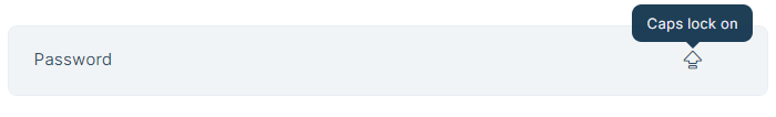
See the result:

To see Caps Lock icon press Caps Lock.