mirror of https://github.com/abpframework/abp
You can not select more than 25 topics
Topics must start with a letter or number, can include dashes ('-') and can be up to 35 characters long.
1.4 KiB
1.4 KiB
Card Component
The ABP Card Component is a wrapper component for the Bootstrap card class.
Usage
ABP Card Component is a built-in ThemeSharedModule component. If you've imported a shared module into your feature module, you don't need to do anything.
// my-feature.module.ts

import { ThemeSharedModule } from '@abp/ng.theme.shared';
import { CardDemoComponent } from './chart-demo.component';

@NgModule({
  imports: [
    ThemeSharedModule ,
    // ...
  ],
  declarations: [CardDemoComponent],
  // ...
})
export class MyFeatureModule {}
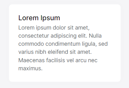
Then, the abp-card component can be used. See the example below:
// card-demo.component.ts

import { Component } from '@angular/core';

@Component({
  selector: 'app-card-demo',
  template: `
    <abp-card [cardStyle]="{width: '18rem'}">
      <abp-card-body>
        <abp-card-title>Lorem Ipsum</abp-card-title>
        Lorem ipsum dolor sit amet, consectetur adipiscing elit. Nulla commodo condimentum ligula, sed varius nibh eleifend sit amet. Maecenas facilisis vel arcu nec maximus.
      </abp-card-body>
    </abp-card>
  `,
})
export class CardDemoComponent { }
See the result below:
As you can see in the example above, you can customize your card component's style with the cardStyle input. You can also add your custom classes with the cardClass input.