# Blazor UI: Customization / Overriding Components
````json
//[doc-params]
{
"UI": ["Blazor", "BlazorServer"]
}
````
This document explains how to override the user interface of a depended [application module](../../Modules/Index.md) or [theme](Theming.md) for Blazor applications.
## Overriding a Razor Component
The ABP Framework, pre-built themes and modules define some **re-usable razor components and pages**. These pages and components can be replaced by your application or module.
> Since pages are just the razor components, the same principle is valid for pages too.
### Example: Replacing the Branding Area
The screenshot below was taken from the [Basic Theme](Basic-Theme.md) comes with the application startup template.
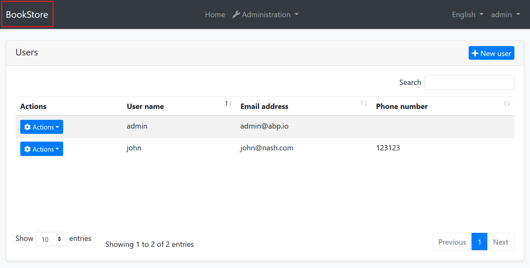
The [Basic Theme](Basic-Theme.md) defines some razor components for the layout. For example, the highlighted area with the red rectangle above is called *Branding* component. You probably want to customize this component by adding your **own application logo**. Let's see how to do it.
First, create your logo and place under a folder in your web application. We used `wwwroot/bookstore-logo.png` path:

The next step is to create a razor component, like `MyBranding.razor`, in your application:

The content of the `MyBranding.razor` is shown below:
````html
@using Volo.Abp.DependencyInjection
{{if UI == "BlazorServer"}}
@using Volo.Abp.AspNetCore.Components.Server.BasicTheme.Themes.Basic
{{end}}
{{if UI == "Blazor"}}
@using Volo.Abp.AspNetCore.Components.WebAssembly.BasicTheme.Themes.Basic
{{end}}
@inherits Branding
@attribute [ExposeServices(typeof(Branding))]
@attribute [Dependency(ReplaceServices = true)]
 ````
Let's explain the code:
* `@inherits Branding` line inherits the Branding component defined by the [Basic Theme](Basic-Theme.md) (in the {{if UI == "BlazorServer"}}`Volo.Abp.AspNetCore.Components.Server.BasicTheme.Themes.Basic`{{end}} {{if UI == "Blazor"}}`Volo.Abp.AspNetCore.Components.WebAssembly.BasicTheme.Themes.Basic`{{end}} namespace).
* `@attribute [ExposeServices(typeof(Branding))]` registers this service (component) to [dependency injection](../../Dependency-Injection.md) for the `Branding` service (component).
* `@attribute [Dependency(ReplaceServices = true)]` replaces the `Branding` class (component) with this new `MyBranding` class (component).
* The rest of the code is related the content and styling of the component.
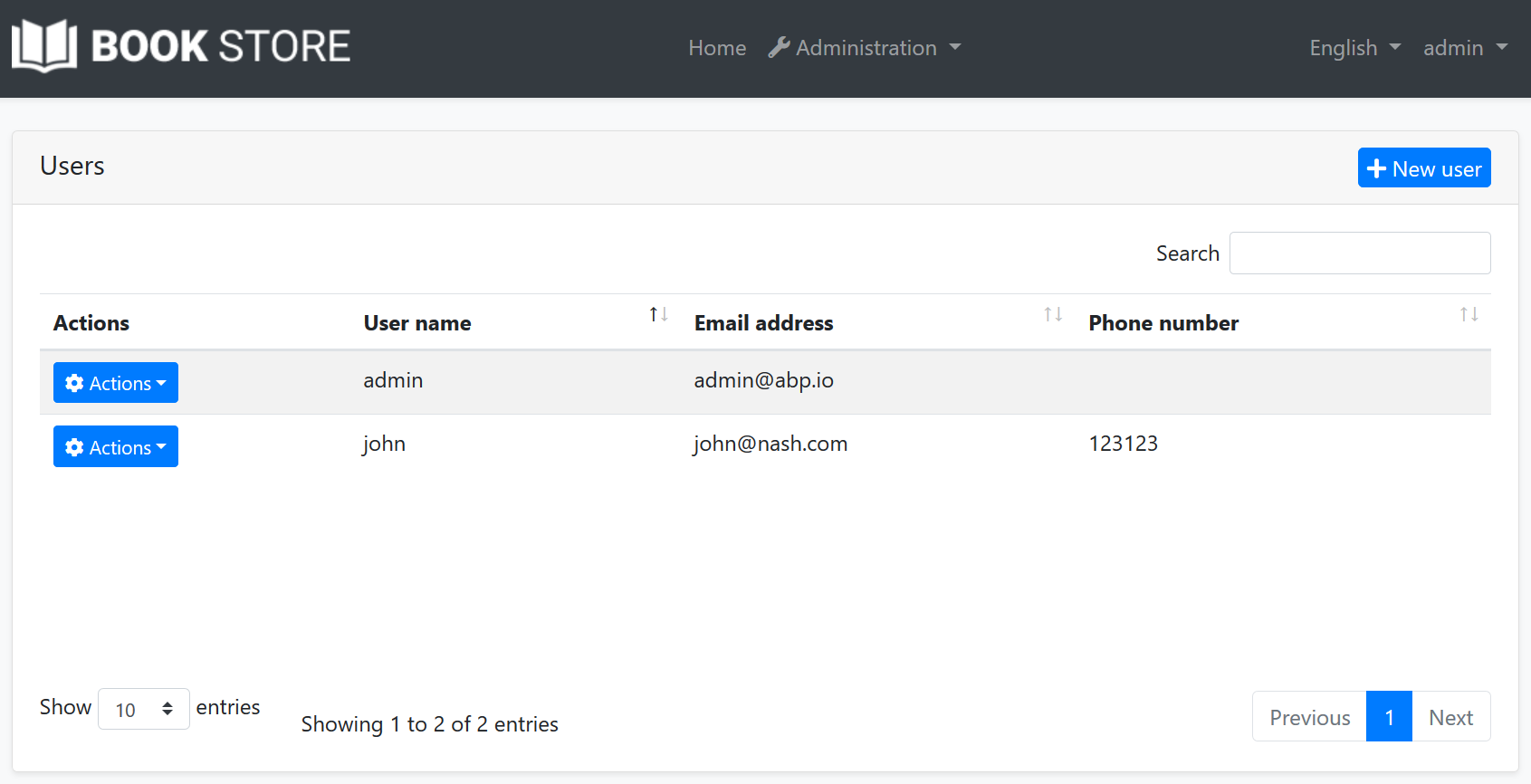
Now, you can run the application to see the result:
> Since the component inherits from the component it is replacing, you can use all the non-private fields/properties/methods of the base component in the derived component.
### Example: Replacing with the Code Behind File
If you prefer to use code-behind file for the C# code of your component, you can use the attributes in the C# side.
**MyBlazor.razor**
````html
{{if UI == "BlazorServer"}}
@using Volo.Abp.AspNetCore.Components.Server.BasicTheme.Themes.Basic
{{end}}
{{if UI == "Blazor"}}
@using Volo.Abp.AspNetCore.Components.WebAssembly.BasicTheme.Themes.Basic
{{end}}
@inherits Branding
````
**MyBlazor.razor.cs**
````csharp
{{if UI == "BlazorServer"}}
using Volo.Abp.AspNetCore.Components.Server.BasicTheme.Themes.Basic;
{{end}}
{{if UI == "Blazor"}}
using Volo.Abp.AspNetCore.Components.WebAssembly.BasicTheme.Themes.Basic;
{{end}}
using Volo.Abp.DependencyInjection;
namespace MyProject.Blazor.Components
{
[ExposeServices(typeof(Branding))]
[Dependency(ReplaceServices = true)]
public partial class MyBranding
{
}
}
````
## Theming
The [Theming](Theming.md) system allows you to build your own theme. You can create your theme from scratch or get the [Basic Theme](Basic-Theme.md) and change however you like.
````
Let's explain the code:
* `@inherits Branding` line inherits the Branding component defined by the [Basic Theme](Basic-Theme.md) (in the {{if UI == "BlazorServer"}}`Volo.Abp.AspNetCore.Components.Server.BasicTheme.Themes.Basic`{{end}} {{if UI == "Blazor"}}`Volo.Abp.AspNetCore.Components.WebAssembly.BasicTheme.Themes.Basic`{{end}} namespace).
* `@attribute [ExposeServices(typeof(Branding))]` registers this service (component) to [dependency injection](../../Dependency-Injection.md) for the `Branding` service (component).
* `@attribute [Dependency(ReplaceServices = true)]` replaces the `Branding` class (component) with this new `MyBranding` class (component).
* The rest of the code is related the content and styling of the component.
Now, you can run the application to see the result:

> Since the component inherits from the component it is replacing, you can use all the non-private fields/properties/methods of the base component in the derived component.
### Example: Replacing with the Code Behind File
If you prefer to use code-behind file for the C# code of your component, you can use the attributes in the C# side.
**MyBlazor.razor**
````html
{{if UI == "BlazorServer"}}
@using Volo.Abp.AspNetCore.Components.Server.BasicTheme.Themes.Basic
{{end}}
{{if UI == "Blazor"}}
@using Volo.Abp.AspNetCore.Components.WebAssembly.BasicTheme.Themes.Basic
{{end}}
@inherits Branding
````
**MyBlazor.razor.cs**
````csharp
{{if UI == "BlazorServer"}}
using Volo.Abp.AspNetCore.Components.Server.BasicTheme.Themes.Basic;
{{end}}
{{if UI == "Blazor"}}
using Volo.Abp.AspNetCore.Components.WebAssembly.BasicTheme.Themes.Basic;
{{end}}
using Volo.Abp.DependencyInjection;
namespace MyProject.Blazor.Components
{
[ExposeServices(typeof(Branding))]
[Dependency(ReplaceServices = true)]
public partial class MyBranding
{
}
}
````
## Theming
The [Theming](Theming.md) system allows you to build your own theme. You can create your theme from scratch or get the [Basic Theme](Basic-Theme.md) and change however you like.