# Adding Dark Mode Support to the Basic Theme
Basic Theme uses plain bootstrap and does not have any custom colors & styles. This article will show you how to add dark mode support to the [Basic Theme](https://docs.abp.io/en/abp/latest/UI/AspNetCore/Basic-Theme).
Bootstrap brings the [Color Modes](https://getbootstrap.com/docs/5.3/customize/color-modes/#dark-mode) feature with version **5.3**. This feature allows you to add dark mode support to your website with a single line of code. Adding the `data-bs-theme="dark"` attribute changes the color mode of the element to dark mode.
## Instructions
1. Create a new project with the following command:
```bash
abp new BasicThemeDarkMode -t app --theme basic
```
2. Create a component that toggles the color mode.
- Create a new file named `Components/ChangeTheme/Default.cshtml`:
```html
```
- Create a new file named `Components/ChangeTheme/ChangeThemeViewComponent.cs`:
```csharp
using Microsoft.AspNetCore.Mvc;
using Volo.Abp.AspNetCore.Mvc;
namespace BasicThemeDarkMode.Web.Components.ChangeTheme;
[Widget(ScriptFiles = new[]{"/Components/ChangeTheme/ChangeTheme.js"})]
public class ChangeThemeViewComponent : AbpViewComponent
{
public IViewComponentResult Invoke()
{
return View("~/Components/ChangeTheme/Default.cshtml");
}
}
```
- Create a JavaScript that manages the last selected theme and toggles the color mode. It stores the last selected theme in the *local storage*. So, you don't need to store it in the database.
- Create a new file named `Components/ChangeTheme/ChangeTheme.js`:
```js
$(function () {
function changeTheme(theme) {
window.localStorage.setItem('theme', theme);
document.getElementsByTagName('body')[0].setAttribute('data-bs-theme', theme);
}
function toggleTheme(){
getTheme() == 'light' ? changeTheme('dark') : changeTheme('light');
}
function getTheme(){
return window.localStorage.getItem('theme') ?? 'dark';
}
function init(){
let theme = getTheme();
if(theme){
changeTheme(theme);
}
}
document.getElementById('ToolbarChangeTheme').addEventListener('click', () => {
toggleTheme();
});
init();
});
```
3. Create a new [Toolbar Contributor](https://docs.abp.io/en/abp/latest/UI/AspNetCore/Toolbars) and add a newly created view component to the application toolbar.
- Create a new class named `BasicThemeDarkModeToolbarContributor.cs`:
```csharp
using BasicThemeDarkMode.Web.Components.ChangeTheme;
using System.Threading.Tasks;
using Volo.Abp.AspNetCore.Mvc.UI.Theme.Shared.Toolbars;
namespace BasicThemeDarkMode.Web;
public class BasicThemeDarkModeToolbarContributor : IToolbarContributor
{
public Task ConfigureToolbarAsync(IToolbarConfigurationContext context)
{
if (context.Toolbar.Name == StandardToolbars.Main)
{
context.Toolbar.Items
.Add(new ToolbarItem(typeof(ChangeThemeViewComponent)));
}
return Task.CompletedTask;
}
}
```
- Configure [Toolbar Options](https://docs.abp.io/en/abp/latest/UI/AspNetCore/Toolbars) and add a newly created contributor:
```csharp
Configure(options =>
{
options.Contributors.Add(new BasicThemeDarkModeToolbarContributor());
});
```
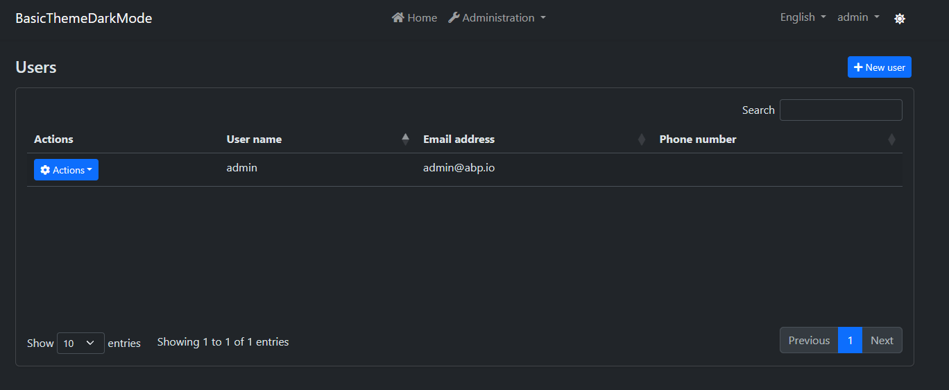
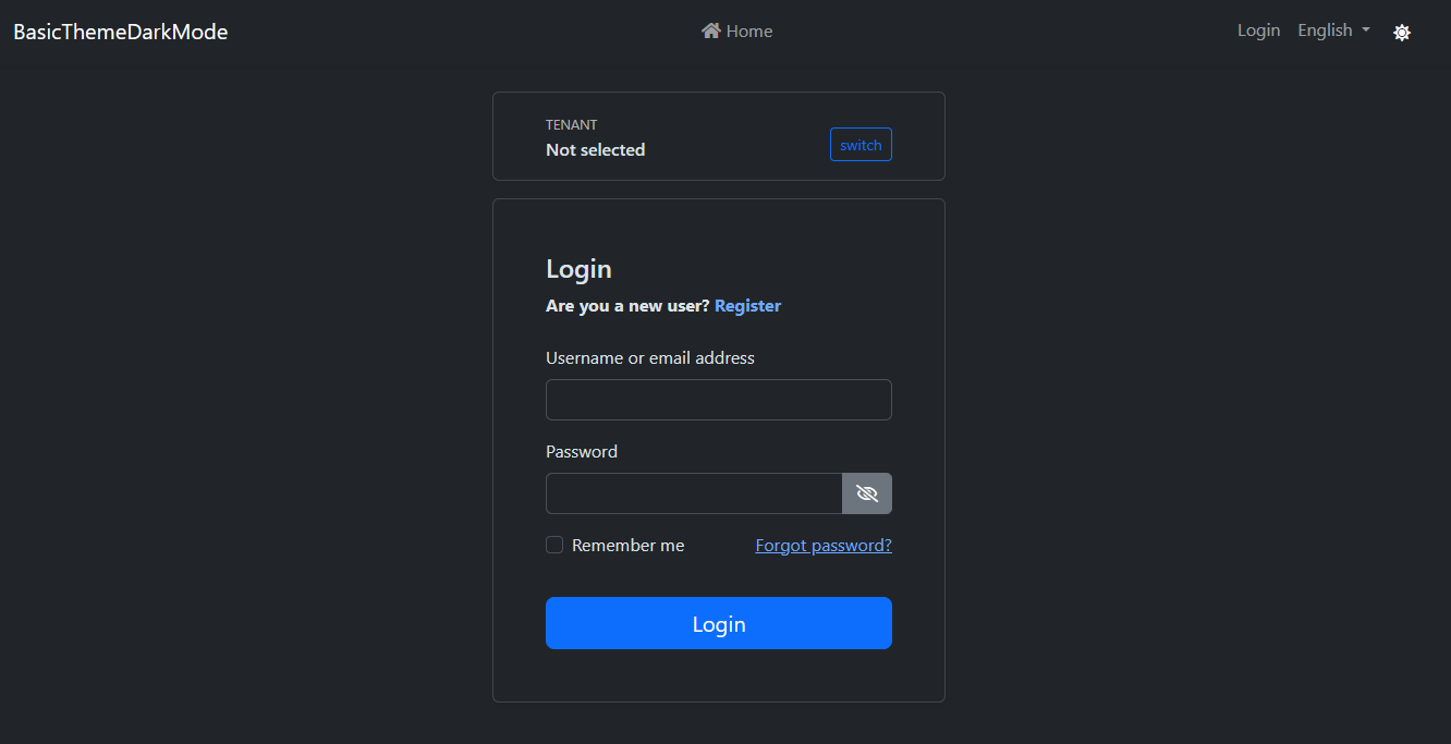
That's it! Now, you can toggle the color mode by clicking the sun icon in the toolbar:

- Users Page in Dark Mode:
- Settings Page in Dark Mode:

- Login Page in Dark Mode:
## Conclusion
The theme is stored in **local storage** and it's initialized on the client-side. You can use **Cookies** to render the page in the last selected theme on **server-side** to prevent the flash effect while navigating pages. This document shows the concept of adding dark mode support of bootstrap to the Basic Theme.